Lesley Riddoch: After fixing the weather map, now get forecasts right
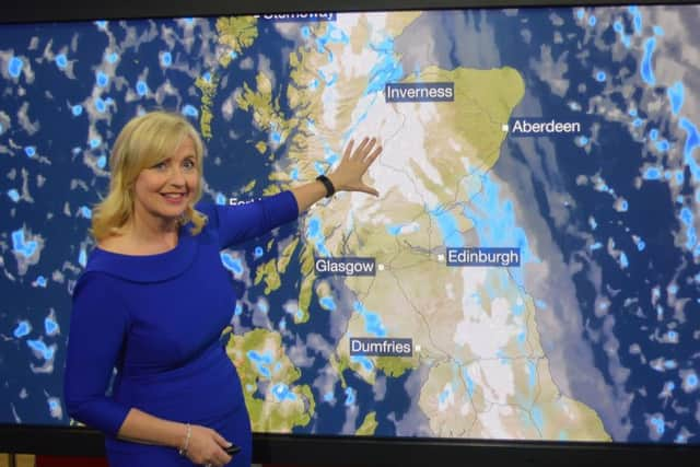
So the BBC weather map is finally showing Scotland at its full size again. Hooray. As viewers have said in messages and website posts – Scotland is back! The change really is that dramatic. It’s not clear why Auntie decided to present a tilted view of the UK in 2005, which exaggerated the size of the south of England and shrank Scotland. Apparently the reversal followed the award of the weather forecasting contract to a new provider. But I imagine complaints might have had something to do with it. Anyway, Ronnie Cowan, the MP for Inverclyde, said the BBC’s decision to change the angle of its weather map proved it had been “misrepresenting the land mass of the UK” for years – a comment which riled Scottish Tory deputy leader Jackson Carlaw, who described it as “risible” and “the worst form of nationalist paranoia.” But did the tilted map just invent itself?
Maps give us a sense of the world and our place in it. And since the world is a hard-to-represent sphere, maps require judgment, and therefore choice. That’s why maps are inherently controversial – according to an article on the BBC’s own website, headlined “Why a map is a window on to history,” which quotes historian Jerry Brotton saying; “Maps … can be tools of power and snapshots of history, and reveal the fears and prejudices of their age.”


Well quite.
Advertisement
Hide AdAdvertisement
Hide AdJerry (Professor of Renaissance Studies at the far-from-revolutionary Queen Mary University of London) continues; “Talk to any mapmaker and they will tell you that the mathematics of mapping the globe on to a flat piece of paper mean that some form of distortion, manipulation and selection will always occur because, to put it simply, you cannot square the circle.”
The infamous Mercator Projection of 1569 distorts the world at the north and south poles, to ensure navigational accuracy sailing east to west because that was the most important issue for merchants and statesmen following imperial sea routes to India and America in the late 15th Century. But is it “right”? Alaska is nearly as large as the continental USA whereas it actually fits inside three times; while Europe (excluding Russia) is only a bit larger than South America whereas South America is actually twice the size of Europe’s land mass. Was this a political issue? You betcha.
That’s why the Gall-Peters projection became popular in the 1970s as politics changed and academics became aware the euro-centric Mercator projection was skewing perception of the importance of the developing world. Closer to home, there’s also the small matter of sea-bed maps which determine the location of the Scots-English border and therefore the ownership of oil, gas and renewable energy wealth. Westminster’s version removed 6,000 square miles of resource-rich waters from Scotland in 1999, by effectively curving the maritime jurisdictional boundary to be equidistant from points on the coastline of both nations. Previously, the boundary was a straight line heading east across the North Sea from Berwick. Who’s right? Such disputes have kept lawyers busy for decades.


But never mind the politics behind the shape and size of Scotland on maps – what about the actual reliability of BBC forecasts?
In 2017 I spent a lovely week on the banks of Loch Tay where it was sunny for the best part of all but one of seven days. On the BBC’s weather service, rain was predicted for the entire week – and I had nearly not bothered to come. Talking to local hoteliers and tourism businesses, many despaired of over-generalised forecasts and inaccuracy for their area. And that’s why many have abandoned the BBC Weather service.
According to the Spectator, a new Swedish app called Climendo has compared the predictions of 10,000 weather stations and rated their accuracy. It suggests American and European forecasters predict British weather with greater precision than the Met Office, which actually lost its contract with the BBC in 2015 due to an EU directive about putting weather contracts out to tender. Strangely though, the Met Office still provides the majority of the data communicated by the new forecasters, the Meteogroup, and the BBC broadcasts Met Office severe weather warnings.
Anyway, Swedish brothers and surfers David and Jacob von Corswant created Climendo in 2012, tracking the historical accuracy of various forecasters for specific locations, comparing them, and combining the best ones in a single app. Their idea was that not all forecasters excel in every area and for every weather metric – just like mobile phone providers have different hot spots – so they aggregate forecasts from The Weather Channel, Wunderground, AccuWeather, NOAA, Dark Sky, or Foreca, and the Met Office. In 2016, Climendo compared forecasts for wind speed and temperature for June from six companies with the actual readings from 300 British weather stations and found American owned Wunder-ground (Weather Underground) was the best predictor of wind speed in one-day and three-day forecasts while Finnish forecaster Foreca was the best for one-day temperature forecasts and the Met Office was most accurate for one-day forecasts of wind speed and temperature – but only in the London area. Nice for London.
The Met Office disputed these findings and put themselves top in every category by assessing wind speed to be correct within five knots of actual readings compared with Climendo’s slightly stricter 4.5mph. Having just consulted the comparison App, it seems the American AccuWeather’s one-day forecasts were right 96 per cent of the time last week where I live compared to Wunderground’s 88 per cent and the Met Office’s 85 per cent.
Advertisement
Hide AdAdvertisement
Hide AdThe Norwegians – not to be outdone – have yr.no, a Norwegian weather site provided by Norwegian Broadcasting Corporation (NRK) and the Norwegian Meteorological Institute. The service, funded by the Norwegian tax payers, currently has around 4.6 million unique users every week. Around half come from Norway, a quarter from Sweden and a quarter from the rest of the world – including many Highland Scots. The service is available in English and covers eight million locations - the first weather site to publish free forecasts for the whole world. Meanwhile a Twitter user posted two different forecasts for Barra on Friday – one from the BBC website and the other from the BBC App.
So are Scots weather watchers getting the best value for our BBC licence fees? That may eventually be a bigger hurdle for Aunty than right-sizing Scotland.
